Thursday, March 12, 2020
Final- The Garden Joan Miro
After looking through some of the artwork and artists that we reviewed throughout the second half of this course, I found this one least appealing. I felt that it was very simple and I did not enjoy it to the same extent as the other pieces of artwork. Joan Miro's work here is very different and he definitely takes a different approach to surrealism than the other artists. This painting seems very simple to me, almost like something you would see in a children's book. Also when I think of surrealism I tend to think of more dark and irrational thoughts. This definitely follows the theme of creating strange creatures but it does not intrigue me like other surrealists work did.
Final Blog: Duchamp's Fountain
Duchamp's "Fountain" is my least favorite artwork that was shown throughout the course. Although his piece is defined as art, I do not see it as such. Art takes passion and effort; all Duchamp did was take an already-created urinal and write words on it. It may be original, but it should not have been viewed as a work of art worthy of getting exhibited for.
Final Post- Henri Matisse Woman with a Hat
My least favorite painting we studied this year is Henri Matisse Woman with a Hat. I don't like this painting because of its sloppiness. I personally don't like the green paint mixed into the face, I don't like how the paint doest stay in the lines of the drawing. Also, a lot of the colors give good contrast, there's to much green for me. I also don't understand the subject of the painting, to me, it is a useless photo. I also think the hat is stupid and sloppy the details of it get lost in the sloppy paint strokes. The only thing I like about this painting is the actual lady herself, I think her features make her look extremely realistic, unlike another artist who twists and contort human bodies. Other than that, I think the painting is sloppy and rushed, I believe this painting could have been beautiful if the right colors had been chosen
Final exam Post

One of my least favorite art works we learned about would be Dance, by Henri Matisse. I dislike this work because I do not like the figures. To me they don't catch my eye. I do not like how the figures are red. I also do not like the background of this art. It does no do the actual figures any justice. The plain blue back ground gives the painting a dark feeling to me. The grass on the bottom is too plain and not bright enough. I feel like the colors are very dark and nothing is eye catching. There could be more to the background and it could have been bright. I also wish we were able to see the figures faces. This would have made the painting more detailed to me. Just having the figures alone does not make the painting anything special. The name Dance makes it seem as if this painting would be bright and happy but to me doesn't seem that bright or happy.
Final Post: Marcel Duchamp - Fresh Window (1920)
I came across this work by Marcel Duchamp when looking at artists we discussed the second half of the class, and this particular piece drew absolutely no interest from me. Unlike some other pieces of Duchamp, like the toilet and the unicycle on the stool where he at least changed the basic appearance of the object to make it his own, all it seems he did or this was paint the glass on the window black. It is still just a basic window, and not really something unique that sets it apart from any other window.
final post- bicycle wheel
Marcel Duchamp made this piece of art in 1913. It is called "bicycle wheel", it is a readymade that is now displayed at the MoMa. This is one of my least favorite pieces of art that we have looked at. I am not the biggest fan of Marcel Duchamp's work. I personally feel that he is taking the work of others, attaching random objects together, and putting his name on it. It is most definitely unique to think out of the box and place two random objects together. Although, I still do not think it is original, because again, he took a wheel off of a bicycle and attached it to a wooden stool. It doesn't look aesthetically pleasing to me. I would not pay for artwork like this.
Final Post- American Gothic by Grant Wood
Final Post
This piece of art by Joan Miro is my least favorite piece of art lately. I like art that paints a clear picture and has a valuable message to take from it. I don't see a meaningful message from this piece of work. It also looks childish to me, the colors and patterns incorporated into this piece very much reminds me of a childish, unrealistic design. It doesn't look like a piece of art you can hang anywhere in your house besides a child's room.
Final Post
Marcel Duchamp's painting "L.H.O.O.Q." created in 1919 is my least favorite artwork. Although I love the painting "The Mona Lisa" by DaVinci, I believe that Duchamp's rendition of DaVinci's classic piece is cheap and lacks originality. Although he was technically original because he put his own twist on a classic artwork, I find that what he added to the piece doesn't add anything to the painting, and if anything, belittles it. In my opinion, drawing a mustache and beard on a well-renowned painting isn't really original; it comes off to me as putting in little effort and lacking originality. Although many of Duchamp's artworks consist of making pre-existing pieces which he originates, this artwork by him is by far my least favorite. I believe that Duchamp shouldn't have called this piece his own original work since the majority of this artwork was created by another artist.
Final Kandinsky Symphony of colors
One of my least favorite artists that we learned about in class was Kandinsky. I found all of his paintings to be busy and loud. Personally, I like simple paintings. I also, thought his paintings were not true art. Even though Kandinsky was one of the first artists to make a painting like this, and art is all about originality, I found that anyone could make a Kandinsky painting. In addition, I didn't like Kandinsky paintings because there was no subject matter. One of the least favorite paintings that Kandinsky did was Symphony of colors. I did not like this painting because It looks like Kandinsky just threw paint onto his canvas. I also do not like this painting because there is no focus point. Everywhere you look in this painting has differnt movements.
Final Post: Vir Herocius Sublimis
Vir Herocius Sublimis
March 12, 2020
This was painted by Barnett Newman in 1950-1951. Out of all the artworks that we have studied and evaluated in the class, I would have to say that this is one of the pieces that I wasn't the fondest of. The background of the painting is a single vibrant color that is darker on the far edges and lightens as it goes towards the middle creating a two-toned of the light and dark shades fo the painting. Then there are only are five vertical lines spaced throughout the painting in which the two are light and slightly faded in contrast to the more solid and defined lines. I understand how the strips complement the main color of the painting to make it stand out creating a color field painting by separating the space with vertical stripes in different shades of contrasting colors, but I just don't find this painting to be that captivating to the viewer. The Strips in the painting also called zips are supposed to bring the painting to life but to me, it needs more life to be breathed into it.
Wednesday, March 11, 2020
Fountain - Duchamp 1917
This is my absolutely least liked piece of art. Although this is one of Duchamp's most famous artwork and it seen as an iconic piece, I find it to be a cheap way of displaying art. His way of thinking out of the box made this one of the most absurd and brilliant pieces of art. The concept of using something already made that he considered art was clever. Some deny that fountain is art but believe it is significant for the history of art and aesthetics.
Although his piece changed art history, I find no beauty or inspiration from this urinal called art. He didn't make it nor design this piece. I believe art should be an expression of feeling mixed with what one sees along with raw material and this is just not it. It lacks fine artistry. I feel that this was called art just because Duchamp said so. I am not impressed.
Thomas, P. V., Galbreth, M., Feehan, A., Sampson, joel, Quaintance, D., & Nowakowski, T. (2017, April 10). "Fountain" At 100: An Interview With William Camfield. Retrieved from https://glasstire.com/2017/04/09/fountain-at-100-an-interview-with-william-camfield/
FINAL: White Over Red (1957) by Mark Rothko
I do not like this painting nor majority of Mark Rothko’s other paintings. There is usually no subject matter and it generally lacks imagination. The painting consists of stacked rectangles of color that appear to float within the boundaries of the canvas. The only feature that seems interesting to me are the different pigments that have been used within the artwork. The tone is boring and I feel quite empty looking at it. I read multiple articles claiming that Rothko used colors that were supposed to create an illusionistic effect on the viewer's emotions or that have a sort of impact on their spirituality. Unfortunately to me, the painting is too bland and lacks actual talent and creativity. Rothko apparently used darker colors to relate to the dark times he was going through in his life. He painted rectangles that were dark red rather than bright red as he descended into different levels of depression. There is probably psychological proof that does correlate colors with emotions, I do agree that can be true. But the idea that staring at Rothko's plain colorful rectangles can evoke certain emotions I don't agree to. On the other hand, Rothko enjoyed the work he created and if he didn't he wouldn't have painted them. Therefore, I wouldn't say his work is terrible just too simplistic for me.
Final: Disliked Frida Kahlo artwork
This art piece I disliked the most in a few ways. One reason why I disliked this piece was the way Diego Rivera looked. His face looked very poorly painted and it looks weird to me. Diego's body itself looks weird. His body looks really flat with no shadows no nothing. Also to me Frida looks a little off mainly in the face and feet. Frida's feet is oddly small. Maybe it is just me but I feel like amiddle school child could paint this and make it look better than this.In all I just feel that Frida did not paint to her capability and feel this piece is more of a slacked piece rather than some of her greater known pieces.
FINAL: Barnett Newman- Vir Heroicus Sublimis (1950-1951)
I personally really did not like this painting done by Barnett Newman. It is so plain and blase to look at. Nothing really pops out at you when looking at it besides a few lines. I even saw this picture in person on our trip to the MoMA and it still did nothing for me. I guess with all the other exotic, surreal, and awesome pieces of artwork we have looked at through the semester, to me this one fell short compared to all the rest. Mark Rothko did a similar style of painting, and is the most renowned of all the color field painters. I have the same opinion about Rothko's work as a color field painter, as I do for Newman. And that is that they are just plain and boring to me. I really enjoy when art pops and almost jumps off the page at you. It gives the piece so much more meaning and emphasis, but with this it is just dull and lifeless.
final exam post
I dislike this art piece by Marcel Duchamp because to be this is not pleasing to the eye or art that I would want to stare at forever. I also don't enjoy this artist's work and really don't understand how this can be considered art. To me, this is just a urinal with no significance to it. Some may interpret this differently and see the creativity and art in this piece but as for me I just can't understand it.
Final Exam- Marcel Duchcamp
This painting by Marcel Duchcamp "Train Painting" was one that I really disliked and didn't really care to look at. His work is associated with cubism which was one of my least favorite movements that we learned about in class. I was confused by what it was a painting of and I honestly am not the biggest fan of his work. Although, his style of work is extremly unique and different. Personally this painting is not pleasing to the eye. I also don't like that there isn't any color to it. Usually paintings that are bright and colorful tend to stand out to me way more. I understand that his paintings are meant not to really have color, but I am just not a fan of it. I probably won't look at any of his artwork in the future.
Tuesday, March 10, 2020
Final: I and the Village by Marc Chagall
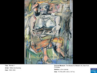
Final Exam- Kooning, Woman 1
This painting was made by William De Kooning between
1950 and 1952. William de Kooning was known and most famous for these works of
art however I dislike them. Kooning was part of the abstract expressionist era
of art and was Dutch. I dislike the main
figure in this painting the "woman" appears more like an ogar with
many distorted features. The feet appear oversized and not human like. The
hands and arms also are distorted. This is not a painting I would want
displayed in my home. The main figure in the piece appears very pale and almost
washed out of the painting. There is also a lot of movement in the background
of the picture that doesn't make sense to me. I dislike that the strokes in the
background are going in different directions. Some of the background is very
colorful while some sections are dark and gloomy appearing. The woman appears
to have some type of animal on her shoulder that is perhaps some type of bird.
The woman looks to be sitting in an awkward, uncomfortable position as well.
Her hips are twisted to the left while her torso is forward facing wither head looking
right. Parts of the background almost appear to be melting down the side which
distracts the viewers eye away from the main subject of the painting.
The Raft of the Medusa
Monet's Agapanthus at the MOMA
While I was at the MOMA, Claude Monet's painting titled "Agapanthus" caught my eye. I found Monet's painting beautiful, and it piqued my interest since we had learned about him during this course. Further information about this painting said that, as an outdoor painter, Monet planted the African plant agapanthus in his garden.
Dorothea Rockburne
Dorothea Rockburne is an abstract painter with an interest in mathematics and astronomy. I like this painting because it looks like a missing puzzle piece. I like how sharp the black and the white look against each other.
Birth of the World (MOMA)
Birth of the World
When I was the Museum of Modern art this was the painting that stood out to me the most. This was painted by Joan Miro in 1925, roughly 7 years after WWI. Liked the brushwork of the black on top of the gray creating a shadow-like effect that really elevated the painting. Although there is little color in this piece of work, the shading, shadowing, and line work are what in my opinion bring s the painting to life. the balloon, trees, shapes, and shooting star add more elements and depth to the painting despite the ominous atmosphere and tone that is projects from the background.
When I was the Museum of Modern art this was the painting that stood out to me the most. This was painted by Joan Miro in 1925, roughly 7 years after WWI. Liked the brushwork of the black on top of the gray creating a shadow-like effect that really elevated the painting. Although there is little color in this piece of work, the shading, shadowing, and line work are what in my opinion bring s the painting to life. the balloon, trees, shapes, and shooting star add more elements and depth to the painting despite the ominous atmosphere and tone that is projects from the background.
Starry Night MOMA
I chose the painting Starry Night by Vincent Van Gogh because it was one of the more famous paintings in the museum. To see a crowd of people standing around this painting, and taking in the artwork was very cool. The painting itself is very majestic and calming, it gives off a magical land that Van Gogh thought about in his head. It is one of my favorite paintings and was a great experience to be able to see it in person
MOMA
Seeing Jean-Michel Basquiat painting up close and in person was really cool. I think so far he is my favorite artist we have studied so far and I love his paintings. There are so many details in the painting that you could like at the painting for hours and still see new parts. Seeing this in person was really cool and made me appreciate the painting and the artist more.
Starry Night Moma
I really enjoyed seeing this painting in the MoMA. Starry Night By VanGoh is an ionic painting that we learned about throughout life. Seeing this painting in person really shows how much detail and work goes into creating a piece of art like VanGogh did.
The Young Ladies of Avigon- MOMA
I really enjoyed seeing this painting at the MOMA by Pablo Picasso. This piece is called The Young Ladies of Avigon and he painted it in 1907. Although we did look at this painting in class, seeing it in person made a huge diffence. I was able to see this painting close up and got to really look at all the detail. The color stood out so much more in person. It was way better being able to admire this painting in person rather than just on a screen.
Andy Warhol’s Shadows ( Dia)
Lee Ufan, Relatum (formerly Language), 1971/2011. Dia Art Foundation
This sculpture is composed of stones and cushions. While reading about this artist it stated that he used natural and man made materials together to make his art pieces. I liked this sculpture because although it appears simple the stones themself appeared very circular and smooth which was probably not an easy task to scavenge for stones of that appearance. The materials used in this sculpture are very opposite of each other.
The Dove- Hilma Af Klint (MoMa)
Klint painted this painting between 1914-1915. I chose this piece from the MoMa because it was different than many of the others. I loved the other paintings but this one stuck out. The way the shapes flow into each other is mesmerizing. At first glance, it's complimentary colors around a heart. All connected in loops, like it's never ending. Then all the colors at the bottom aren't just complimentary colors, it's all of them. All the colors flow into one another, never ending, making a beautiful masterpiece. The technique of painting the dark colors, and light ones, and how some colors overlap one another is beautiful.
Monday, March 9, 2020
The Jungle (1943)- Wifredo Lam (MoMA)
Lam worked for three years with Surrealists in Paris and from that work he created this piece called The Jungle. He wanted this to convey the haunting consequences of slavery and colonialism for his homeland of Cuba. He painted crescent-shaped faces recalling African Pacific Islander masks, against a background of sugar cane, since Cuba is the world's largest sugar exporters. Lam wrote about this piece that, "I wanted with all my heart to paint the drama of my country...to disturb the dreams of the exploiters." This is such a fascinating piece done by him and have never seen it before or have heard of it. It was so eye-catching that I had to take a picture of it and blog about it.
Sunday, March 8, 2020
Pablo Picasso's Woman Dressing Her Hair (from MoMa)
When I went to the Museum of Modern Art, I took this picture of Pablo Picasso's painting. I really liked it because it shows off his application of cubism. It is depicting a woman inside a boxlike room that is bigger than her own body. She looks awkward and compressed and I like the detail he incorporated.
Thursday, March 5, 2020
Red Rabbit- Basquiat
This painting by Basquiat stood out to me because it has interesting details added to it, such as all of the mix of different colors that make up the cat and the whitish image in the background. You can tell that Basquiat had a unique vision of art in his mind and interpreted it differently than others might. I like how his art pieces stand out from others and really depict his own personality and artistic style.
Skull
Basquiat
I like this drawing because it looks like it was a quick sketch but there is still so much detail in it. I love how the face is incorporated into the flower.
Bird on Money
I chose this painting because i liked the blue and yellow colors used together. There is a lot going on in this painting but i like how the bird stood out the most. His paintings almost seem child like but too sophisticated and laid out to be done by a child.
Subscribe to:
Posts (Atom)


